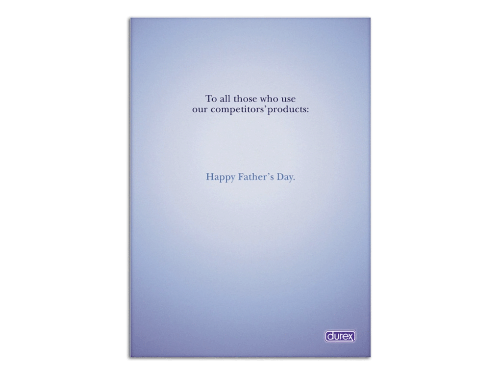
Look at this one Ads from Durex... well actually everybody known that durex ads usually being stereotype with overrated picture and symbol. now they have come with just plain simple text and the body copy is something to ponder of by their competitor
Emotion: Funny and Sarcastic
Idea: Happy Father Days
Concept: This announcement is intended major consumer loyalty and not launch a new product to market, for example. For this reason, the copy has a certain ironic that fits nicely with the message as it is to discredit their competition to gain more prestige and hold a good position in the market. So, with a simple text, the brand manages to convey implicitly the quality of their product, such as safety, quality and reliability. The fact that an image does not appear in the ad, it reinforces the importance of the text, and especially the message the brand wants to convey to its target.
Rationale : Durex, in this case, manages to convey a very direct and powerful then a very clear message to their target: They are better than their competition, as those who have not used Durex, are now parents because the products of other brands are not as strong and reliable as other competitor.
With a single copy without any images, except the logo of the brand, I think it is very powerful and direct an ad that does not leave anyone indifferent.


